For the Print Minor Task I decided to use to use iconic productions related to the genres I am focusing on. Clueless, Bride Maids and The Hangover are all productions that I am using for inspiration for the print minor task.
My takes from these 3 posters are that I need to focus on the positioning of the main characters, the colors of what they are wearing, the expressions of the main characters and the font being used. In all of these the font is extremely well thought and it matches with the style of the film, except The Hangover.
The Hangover poster makes a lot sense by the expressions of the charcaters and the acessories being used, like the sunglasses, dirty clothing, missing tooth, bleeding mouth, scrunch face and etc. Those are all small details that make such a big difference indicating and expressing the emotions the movie is portraying. The background is shiny with stars, which I don t think it looks good, yes it emphasis the focus on the characters but it looks basic and simple, I feel like a btter alternative would be using a dark color and small pictures that would set the location of the movie. The font used in the top doesnt match with the rest also making it feel overwhelming to look at, but if the background had pictures or signs indicating it would be in Vegas, that wouldn't be necessary.
 |
| Poster of 'The Hangover' |
After analyzing the poster of Clueless I want to incorporate how the colors of the clothing and background work together to bring in the attention into the main character, not only the colors and positioning of the actors give the sense of how the movie will be about three characters and the usual girl trio, but the colors all match and extremely aesthetic pleasing to look at. Making the poster much more enjoyable to look at compared to to the Bride Maids poster.
 |
| Poster of 'Clueless' |
The Bride Maids Poster also uses colors to indicate who the main character of the movie will be and the colors are vibrant indicating the drama that will occur in the movie, however the brick wall in the background of the poster does not sit right with me. The Brick wall background brings in no additional information about the movie, besides it being ugly to look at it makes no sense at all of why it is there.
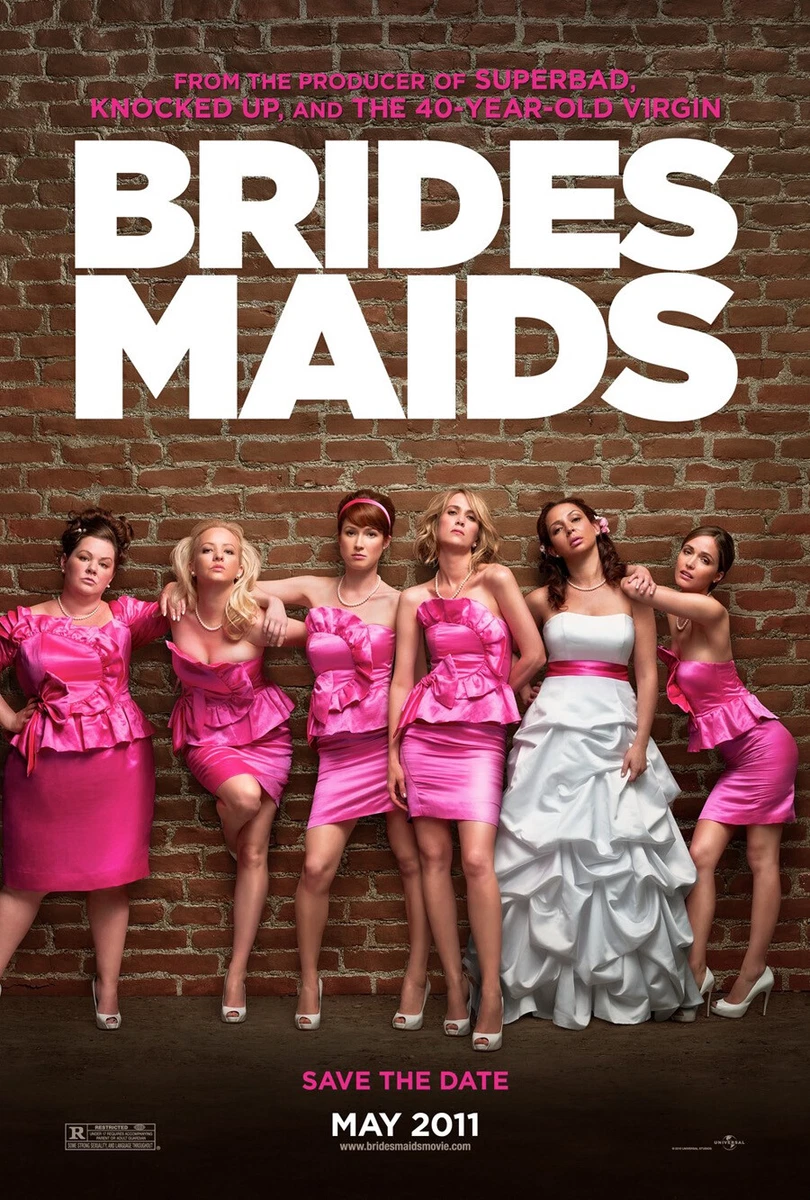 |
| Poster of 'Bride Maids' |
My plan for my print media is to use the key details that was in the Hangover movie, the color combination of Clueless and try my best to make it aesthetic to look at, while also using the expression of the characters and vibrant colors of Bride Maids.
No comments:
Post a Comment